After a fire raged through Hampton Court Palace, a huge restoration effort took place to restore its historic halls and royal bedchambers.
Historic Royal Palaces, the charity responsible for maintaining the building, reached out for new interior designers in some cases, but what they needed most was experts to emulate the architecture as accurately as possible.
One of these experts was Patrick Baty, an ex-army man who had spent the days following active duty helping out in his father’s paint shop. Like most people who find themselves occupying a niche, Baty’s career as an historical paint consultant materialized almost by accident.
But it’s taken him around the world on restoration projects and into Britain’s most spectacular private homes. As arguably our most knowledgeable and influential paint expert, he’s worked out the exact hues of Handel’s house in Mayfair and Benjamin Franklin’s house in Westminster.
The latter involved him sifting through 40 volumes of Franklin’s letters to his wife, only to come across two references to colour the entire time. Over a 30 year period, Baty has also worked on Tower Bridge, BBC Broadcasting House and the painted hall in the Royal Naval College in Greenwich.
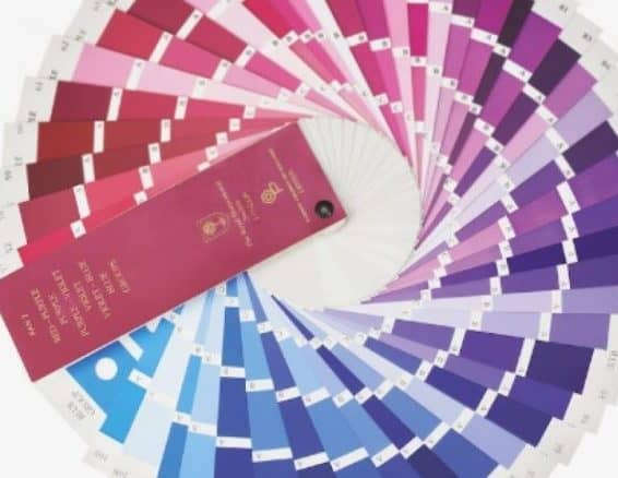
The Royal Horticultural Society’ colour chart
Paint analysis combines rigorous historical research with a keen eye for artistic detail to peel away the decades. The technique is similar to that used by a fine art historian hired to assess a forgery, although Baty stresses he doesn’t possess the expertise for that job.
“It’s a cousin of that,” he explains. “House paint always used to be called ‘vulgar painting’ because it was simply coat after coat, not multiple glazes or anything like that, but the techniques for analysis are exactly the same.”
In his time, he’s reunited an 18th century doorframe with its stately home, and even found the doors to the Prince Regent’s bedchamber in a house in Devon. “There are times where this geeky interest actually has more than a frilly result,” he says.
He supposes the fascination with colour came from his great-grandparents, who were celebrated artists. As a child, he was dragged around exhibitions of Robert Bevan and Stanislawa de Karlowska’s work and his grandfather has been credited as the first Englishman to paint with pure colour (no white added to dilute it) in the 20th century.
But he began to find his niche when he joined the family paint business, Papers and Paints in Chelsea, in the early 80s and customers began to ask him questions he couldn’t answer. “They’d ask funny little things like ‘I want a good Adam green’ and I knew enough to know that Robert Adam had been an architect in the late 18th century.
Parsons’ ‘Endelflat’ Enamel chart
"I set out to learn about what pigments were around and which ones could be used to make greens. I’d do fairly geeky things like make up very small batches of colour, just to get my eye in and see the range of greens.”
After many weekends raiding the V&A and the National Art Library’s archives for references to “Sir John Soane yellow”, Baty decided to sign up for an independent research degree at what is now the University of East London.
His final dissertation well exceeded the word limit but “I just threw everything into it because I knew I wouldn’t have the opportunity or incentive to do it again. Plus, I knew I’d have something to take with me, a body of work that I could refer to. A lot of it has ended up in that book.”
The book he’s referring to is The Anatomy of Colour: The Story of Heritage Paints and Pigments, a beautifully illustrated compendium that’s being published today. Baty has been approached to share his considerable knowledge three times before, but this is the only attempt that came to fruition.
He makes no claims about being an academic and stresses that the book isn’t a definitive history of paint “otherwise I’d have some serious competition.” It isn’t an interior design guide either; rather, it’s an introduction to a fascinating slice of design history that paints a picture of British society across a 300-year period.
“People talk in terms of Georgian or Victorian colour; it’s not like that,” Baty says. “Apart from anything else, it’s not as though, come 1837, the treatment of colour used on walls changed dramatically. There are overlapping circles, with peculiar influences coming in.”
Not to mention wars, new monarchs and The Great Fire of London in 1666, with the tremendous effort to rebuild the City of London afterwards. At the time, the company of painter-stainers, a City livery company, ruled the roost, but the sudden increase in its workload exposed its restrictive working practices, leading to wage regulation being handed back to the government.
Hand-painted cards from 1807
As well as changes in working conditions and tools of the trade, the book charts the rise of DIY and the indispensable role of the colourman in the mid-17th century, a now defunct profession that used to supply paint to artists and housepainters alike.
The clean lines and quiet pale colours of the 1930s – think the original BBC Broadcasting House – were themselves a reaction to their times, a repudiation of the clutter and embellishment of the early 20th century in a time of austerity.
“I don’t think we’ll be able to choose a colour with confidence from a monitor in my lifetime. And I think that anyone who chooses paint colours from a website needs their head examined. The more you get involved with colour, the more ifs and buts you discover. It’s a miracle that anyone ends up with what they want!”
Yet, colour palettes and theory boomed again following WWII, leading to the establishment of the highly influential British Standard Range of 1955, a series of 101 colours agreed upon by RIBA and partners as part of a huge public infrastructure programme. Classrooms were painted in light, undistracting colours, while bold primary shades were banished to entrance halls and the occasional external panel. Offices, too, were instructed to be bright, clean and cheerful.
“Many of that generation were driven to create this new world, now the war and all that unpleasantness was out of the way,” says Baty. “They were really excited, idealistic and completely logical – I’m afraid I’m a bit like that from my years in the army – and there’s a reason for things, including for colour which has the potential to be so random. As soon as I see those colours, they immediately evoke a particular period and there are very few duds in that range.”
While those colours conjure up the Blitz spirit and post-war baby boom, 18th century paint colours spoke of a society much more preoccupied by class. So-called common colours, like cream, lead, pearl or stone cost around 2p per pound of paint in today’s money, whereas only the top brass could afford to paint their walls orange, lemon, pink or blossom, as these cost 12p per pound. The finest – fine deep green – went for 12.5p per pound, and this colour classism carried into culture, too.
“There was no justification at all for charging what they did, but by charging it, they established it as a prestige colour,” Baty says.
“You’ll see in one of Hogarth’s sequences a countess in her boudoir, which is painted fine deep green, and then at the end of her decline, she’s returned to her father’s house, which is a timber colour, the other extreme. So there are subtle ways in which colour was used pictorially to express hierarchy. Our predecessors would have been aware of this, but we’ve lost the knowledge that different colours were different prices.”
Another very human trait that seeps into colour history is our capacity for wilful ignorance. White lead, a main constituent in paint until the 1950s, slowly poisoned homeowners for hundreds of years, yet no one wanted to switch to a less suitable alternative. Comparing it to smoking and pollution from cars, Baty says everyone knew about the dodgier components of paint from the start, even calling some shades Arsenical Green and Lead Red.
He also briefly alights on colour theory and the imperfect systems we’ve developed to communicate colour, telling an illuminating anecdote about the little volume of colour Charles Darwin took with him to the Galapagos so he could describe the colours of the animals he brought back with him, which were often bleached by the formaldehyde or alcohol they were preserved in.
“All he had was a verbal description using a common limited language. That’s something that’s still a big problem.” On a day-to-day basis, Baty uses a spectrophotometer to analyse paint, but its readings are rather incomprehensible to the layman – and clients.
Read more: How Airbnb is revolutionising office space
Working with academics at the University of Derby, he got excited when they thought they could develop digital monitors to accurately convey differing shades of colour. Without taking into account the subjectivity caused by biology – varying quality of eyesight and the fact 4.5 per cent of the British population are thought to be colour blind, according to Colour Blind Awareness – technology just hasn’t advanced enough in this field.
“The more I got into it the more I realized it depended entirely on the calibration of the monitor and a laptop would never, in the foreseeable future, have that sophistication. And when you did viewings, you’d have to have it in a shielded room, and you’d have to be so many feet away from it, with no lights – we’re talking about a world that doesn’t exist,” Baty says.
“I don’t think we’ll be able to choose a colour with confidence from a monitor in my lifetime. And I think that anyone who chooses paint colours from a website needs their head examined. The more you get involved with colour, the more ifs and buts you discover. It’s a miracle that anyone ends up with what they want!”
So the next time you browse through Farrow & Ball or Dulux’s colour range, prevaricating over whether to paint your shed Radicchio or Sumptuous Plum, you’re engaging in an imperfect, yet exquisitely complex dance that has stretched back for hundreds of years.
The Anatomy of Colour: The Story of Heritage Paints and Pigments by Patrick Baty is published by Thames & Hudson today in hardback, RRP £35
The article
The history of colour paints: Patrick Baty, Britain's foremost paint historian unearths hidden treasure in his first book The Anatomy of Colour
was first posted on http://www.cityam.com